Friday, May 03, 2024

JOSEPH CLEMENT COLL: THE ENEMY OF CROSS HATCHING

I've said some unkind things here about cross hatching-- those intersecting lines that are used to add tone to a drawing.


Artists who aspire to something higher use line more descriptively, to add dimension, contribute vitality, describe form, or make some other kind of artistic statement.  Cross hatching, like stippling, is the kind of busy work that might be delegated to an apprentice, or even replaced by zipatone.

To illustrate my point, look at what the brilliant Joseph Clement Coll did where lesser artists might have used cross hatching.


Compare the vigor in these details (blown up larger than the orignals) with the quiescence of regular cross hatching.  Even when we step back and can no longer detect these tiny details, the whole drawing remains infused with energy:


In a generation of great line artists, Coll was one of the best.


Monday, April 29, 2024

ONE LOVELY DRAWING, part 73

I love Frederic Gruger's drawing of a confrontation between a Russian princess and a group of leering Bolshevik invaders.


Gruger was famous for making paintings using nothing but a Wolff pencil, cheap cardboard and spit. (Later, he upgraded from spit to water and when he really began making money he added watercolor  wash accents.)

Gruger's illustrations were striking for his ability to achieve rich velvety tones, but he also knew how to draw with a pencil point:


Gruger expertly staged his picture with details and lighting.  Here is an artist who was firmly in control of the room.


But the feature I'd like to point out today is the faces of the mob in the background (reproduced here several times larger than the originals).

In the 1920s, without the benefit of the internet, Gruger captured the ruddy smiles of Eurasian peasants


Each of these ruffians in the front row has a distinctive face, but note that as the faces get further into the background they dissipate into abstraction.  They become shapes in a composition.


The painting on the wall in the background is another example-- rather than draw a representational image, Gruger blurs it into abstraction (with nice strong compositional shapes). 


Gruger's prioritization of elements is part of what holds this picture together so tightly, and makes Gruger an artist, not just a draftsman.


Monday, April 22, 2024

ONE LOVELY DRAWING, part 72

This drawing by James Montgomery Flagg is as confident and brash as Flagg himself.

The drawing is large-- nearly 30 inches (76 cm) and appears to have been drawn mostly from the elbow.


Like Franklin Booth, Flagg created values using numerous parallel lines:


However, unlike Booth, Flagg used bold lines, aggressively combining pen and brush.  Booth carefully planned his drawings, but you can see from Flagg's pencil lines how loose and fluid his preparations were.


This is not digital drawing.  You don't see much like it these days. 


Wednesday, April 17, 2024

ONE LOVELY DRAWING , part 71

Franklin Booth (1874-1948) learned to draw by studying wood engravings in magazines while he was growing up on a farm in Indiana.  He mistakenly thought the engravings had been created with pen and ink, and so developed his highly unusual drawing style simulating engraving lines.


I usually prefer drawings with a more direct and expressive line, as opposed to  clusters of lines used to create values.  There always seems to be more painstaking effort than necessary in Booth's drawings.  Still, when you look at extreme closeups of what Booth accomplished, you have to respect his consummate craft.  


I'm impressed that as a wrangler of all those lines,  Booth is able to maintain such control over lights and darks.  That's not easy:


Contrast Booth's drawing with the work of other, lesser artists who let their lines get out of control: 

John Buscema, inks by Alfredo Alcala


Reed Crandall

Some fans are impressed by the sheer level of effort in drawings containing thousands of fine lines, as if the level of work gives the picture credibility.  But Booth's gift has nothing to do with making lots of scratchy little lines.  It's not the manual labor,  it's the control.


Saturday, April 06, 2024

MEN MUST ADVENTURE AND WOMEN MUST WEEP

The stories in comics, pulp magazines, science fiction and fantasy were never subtle about the proper roles for men and women.  Here is Flash Gordon by the great Alex Raymond:


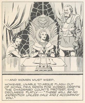
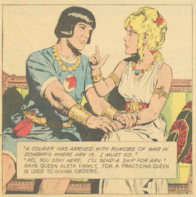
We see a similar perspective in Prince Valiant (1972), drawn here by John Cullen Murphy:


In 1959, Hal Foster drew our hero taking a more hands on approach:


Prince Valiant by Hal Foster

The politics of these stories have been the subject of robust debate.  I leave that debate to others. 

What interests me is that the words are only one small part of narrative art, and the non-verbal portion-- the lines, colors and shapes-- can express a gender orientation of their own.  

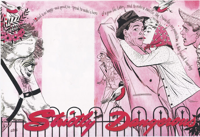
In the 1950s, illustrator Albert Dorne was commissioned to illustrate a story for Cosmopolitan magazine. The story involved a barn that burned down at night, a cow, and a young couple confronted by crooks.  Dorne turned in this powerful illustration:


But Cosmopolitan rejected the picture.  Dorne recalled the phone call he received from the art director:
"Albert, your drawing is swell but we are afraid our readers will not like it.  The violent fiery red is a bit frightening, the interpretation too literal.  We have found from our readership polls, etc. etc. Would you mind doing it over?" 
Dorne was irritated.  He recalled, "The audience in mind being primarily women, I knew I couldn't actually show fire, so I... created the illusion of fire by lighting the picture with a deep fiery glow from off stage."  But that wasn't sufficient.  The picture's strong, high contrast treatment, with pointed fingers, sharp angles, extreme positions and facial expressions was still viewed as too yang for a female audience. 
 

Cosmopolitan presented Dorne with "a layout designed in a much lighter vein and quite gay in its concept."  The art director explained, "This is the sort of thing our readers like."

Dorne (a powerful, cigar smoking man and former prizefighter) bitterly started over and this time turned in a much softer, pinker, friendlier picture:


To his amazement, Dorne received a flood of compliments for the revised illustration, not just from the readers of Cosmopolitan but from art directors of other women's magazines who thought that Dorne's light and charming style would be well suited for their audiences.  

This was not a conspiracy between a male artist and a male art director.  The patriarchy had nothing to do with these aesthetic choices.  These were the colors, lines and shapes proven to induce more women to buy and read the magazine. 


Friday, March 22, 2024

WHAT ALICE MOLLON UNDERSTANDS ABOUT INK


There's a long tradition of wars with-- and about-- ink:

 (The Ink Battle by Utagawa Kuniyoshi 1843)

Ink has left a trail of rivalry, braggadocio, hostility and sometimes just general commotion.


Ink as a weapon can be flung, spattered and scrubbed; it can be a tool for slapstick and a tool for marking rivals with an indelible stain.  

(Toshikage, 7 Gods Fighting with Ink, 1888)

(The Ink War)

There's no denying the yang in ink. Even when it's not literally ammunition, it frequently serves as metaphorical ammunition. It settles scores.  It inflicts harm.  It leaves a fossil record of violent action.  

(Ralph Steadman, the Malevolence of War)

But when it comes to the heart of ink, Alice Mollon may have a wiser understanding. 

Alice Mollon's illustration of ink slipping nude into the world

It's not that Kuniyoshi is wrong; it's just that there are more important truths in Mollon's delicious picture of ink taking form from the brush.

Look how smart this picture is. At first it seems simpler than the pictures above-- flat blank background, simple digital colors, one figure, few details, uncluttered.


But the few subtle details are so well chosen, anything more would've been less.  The toes turned inward, the brush that doubles as hair so effectively, the raised arms that help create a feeling of liquid flowing from the concealment of the brush, to take shape on the dry surface below.  This picture reminds me of Botticelli's Birth of Venus.   

Nicely done.